Decathlon
Goal: Position the experience for sports enthusiasts, not elite athletes.
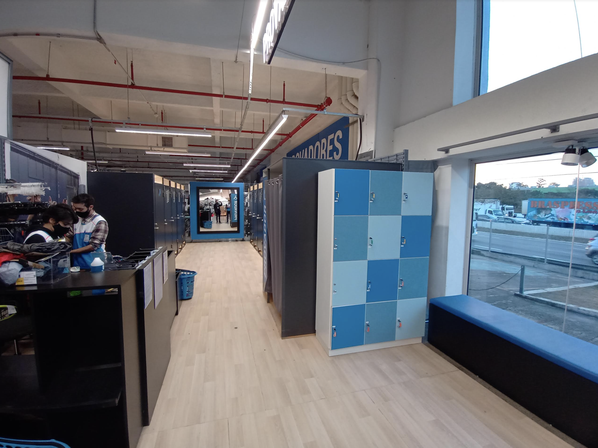
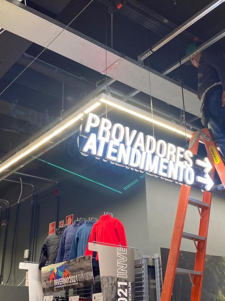
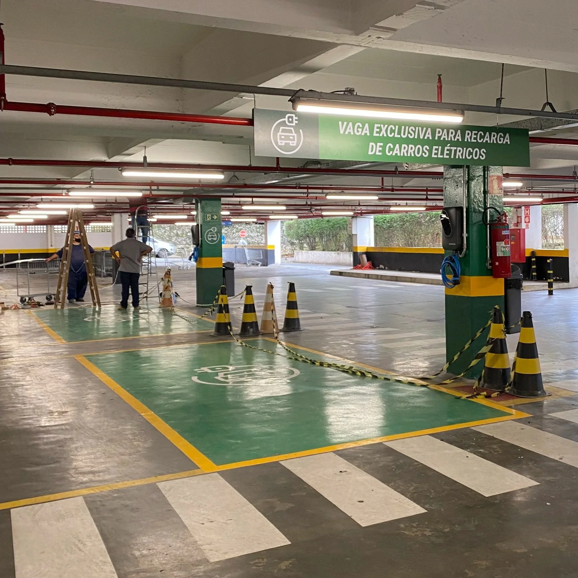
Challenge: Opening more than 20 mall stores in a short timeframe during the pandemic. This involved redesigning facades, crafting themed stories, enhancing wayfinding and floor plans, and using tech nationwide.
Action: Designers benchmark using the French design system. We collaborate with cross-functional teams and specialized vendors.
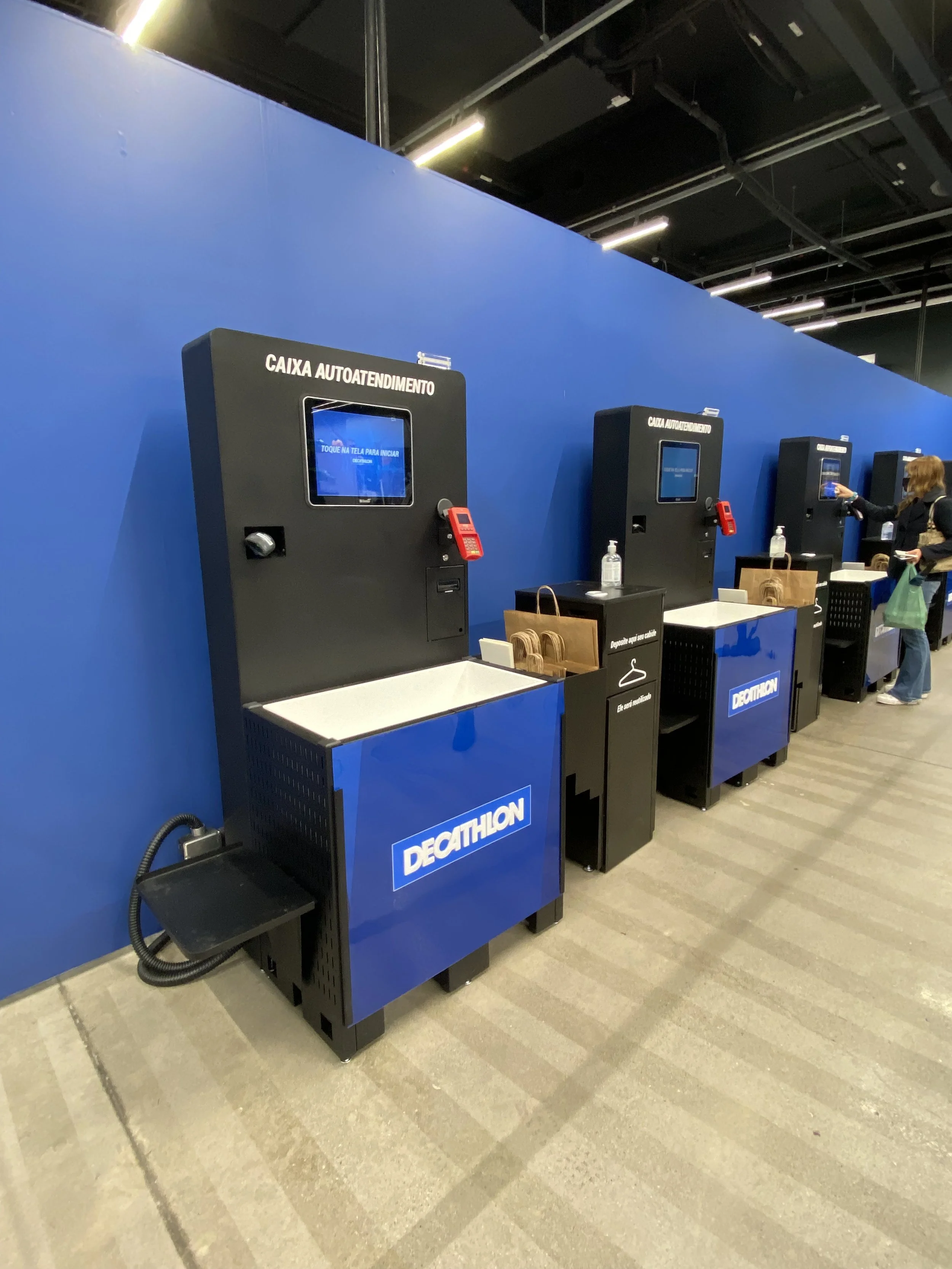
Result: A historic milestone for Decathlon in Brazil: more than 40 stores were equipped with new self‑checkout kiosks in under one year.
Work performed: Concept Development, UX/UI Design, Prototyping, Design Planning.
Self-checkout
I helped Decathlon Brazil make its first self-checkout pilot a scalable and steady brand experience.
We matched familiar patterns, enhanced contrast, and clarified icons. We also adjusted the hardware to fit actual store behaviors. As a result, we surpassed our initial target of 4 self-checkouts. We rolled out 7 in the flagship store and added 4 to 8 units across other locations in under six months.
Project Overview:
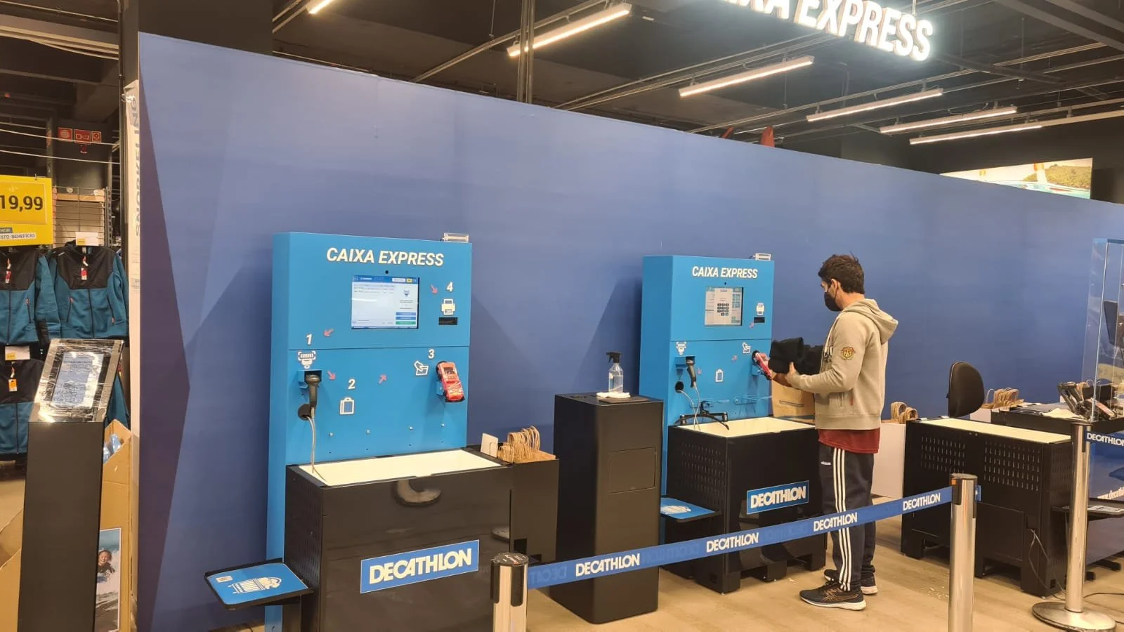
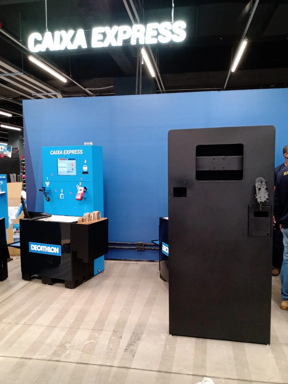
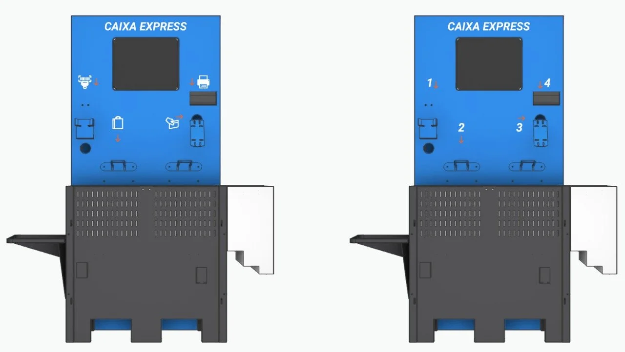
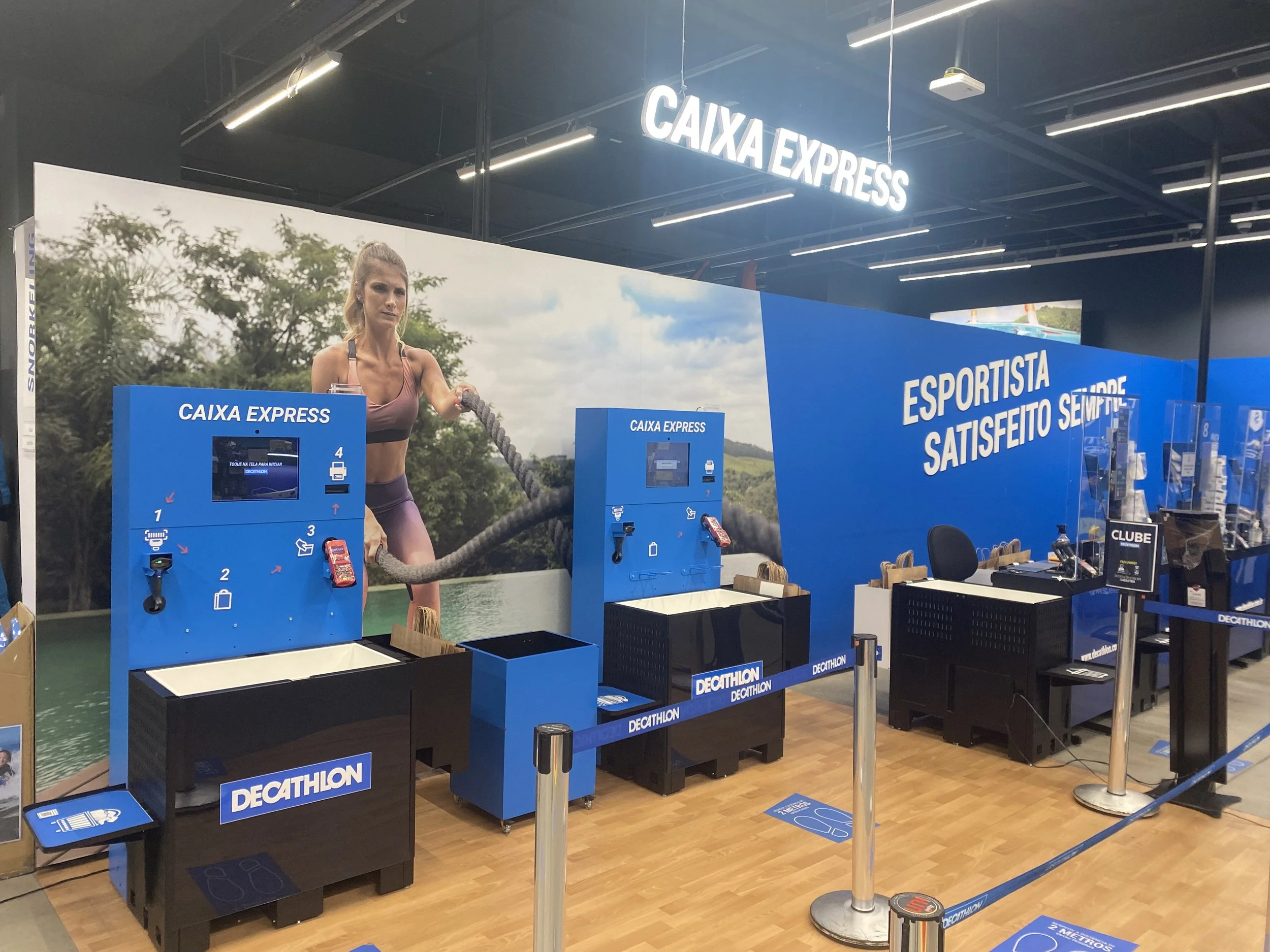
During the pandemic, Decathlon Brazil launched its first self‑checkout pilot. The initial kiosk (“Express Checkout”) featured a blue totem and wall background, but the software was slow, the interface was confusing, and the unit’s large footprint felt misaligned with customer expectations.
I joined the project proactively, leveraging prior experience designing totens / kiosks, to modernize the product experience and optimize the physical and digital touchpoints for scale.
Context and Challenge
Health and speed were critical customer needs.
Unlike small supermarket units, Decathlon required a larger kiosk to handle bulky sports items (e.g., basketballs, swimming accessories).
We aimed not to “reinvent the wheel,” but to align with existing mental models of self‑checkout already familiar in the market.
Role and Responsibilities
UX/UI design for the totens interface and visual system.
Heuristic evaluation and in‑store observation to map customer pain points and operational constraints.
Design exploration focused on legibility, contrast, iconography, and brand alignment.
Collaboration with stakeholders to validate feasibility and accelerate acceptance.
Process
Over several months of daily testing, we mapped pros and cons across the customer and operational journeys. We prioritized clarity, efficiency, and brand coherence. Early drafts already targeted modernizing the look and removing friction points observed in the pilot.
Key Design Decisions
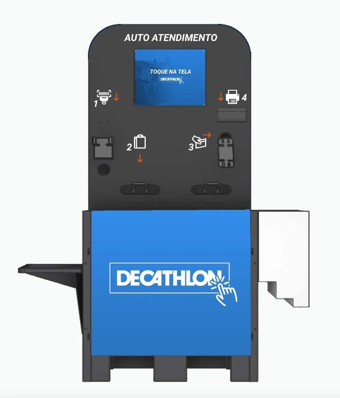
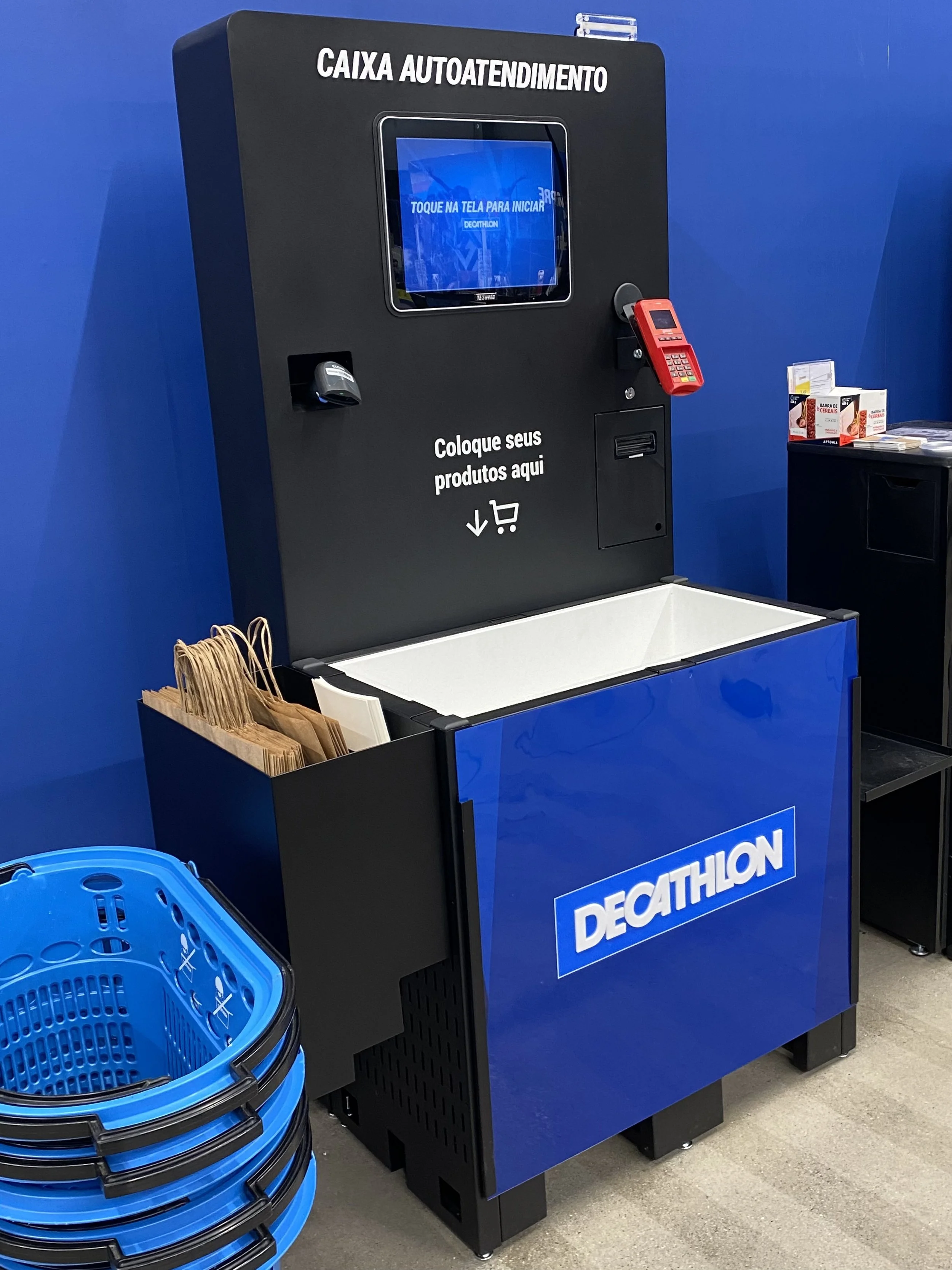
Visual system shift to black for higher contrast and improved legibility of headers and on‑screen content, without diluting brand equity.
Full adoption of Decathlon’s design system and the use of athlete imagery to reinforce brand context and guide users visually.
Refined iconography and color usage to support quick comprehension and reduce cognitive load.
My 2 years of experience with photo booths and totems, with BLUBOX helped me get into great visuals and design.
Why It Worked
Familiar mental models: We kept the internal flow consistent with known self‑checkout standards, reducing the learning curve.
Fit‑for‑use form factor: The larger unit served Decathlon’s product reality while remaining easy to understand.
Clarity and contrast: The visual overhaul improved readability and reduced errors.
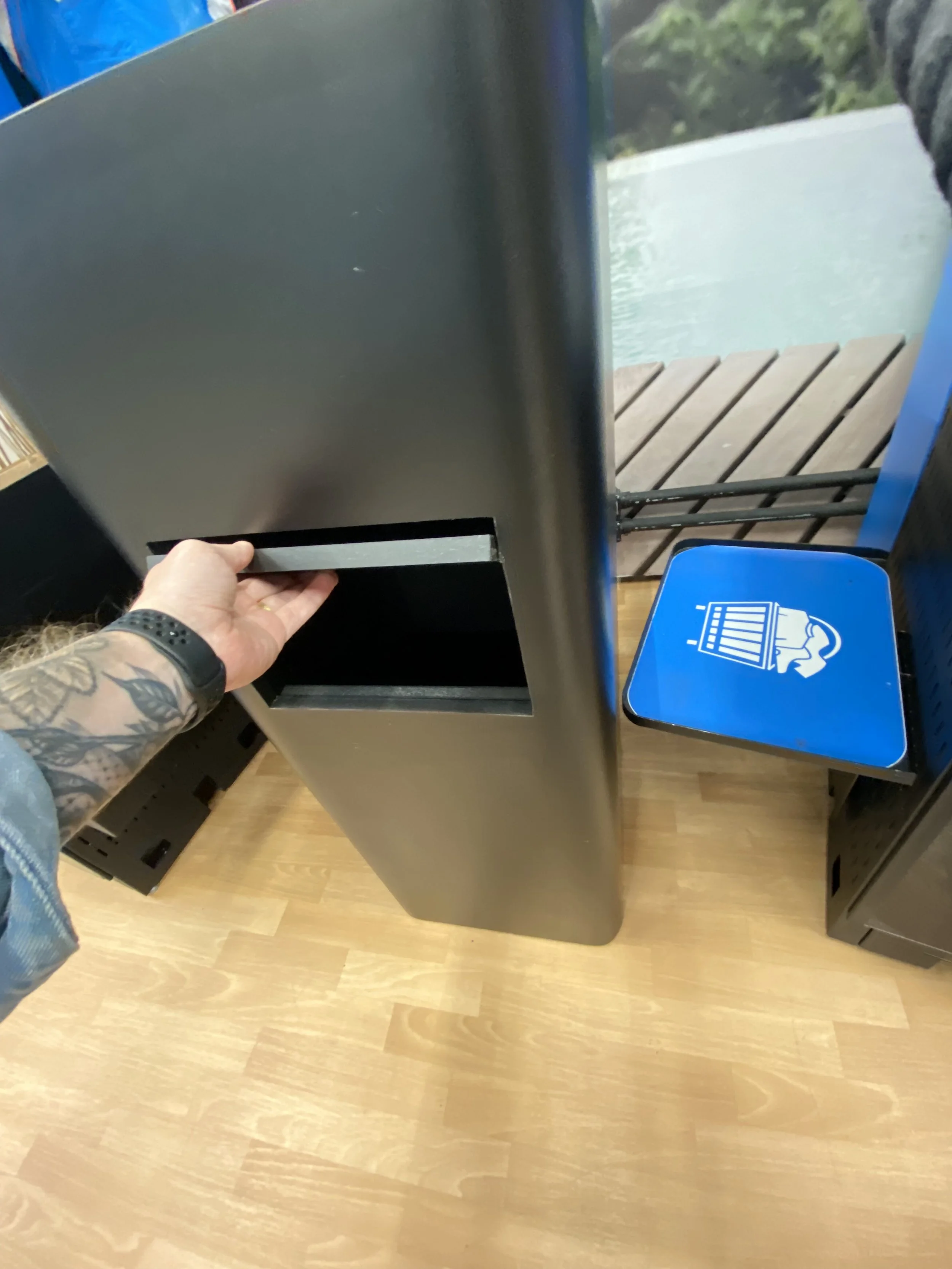
Operational empathy: Design decisions (e.g., hanger hooks) addressed real store behaviors, boosting throughput and cleanliness.
Outcomes and Impact
The initial goal was four kiosks. Due to strong customer adoption, the Av. Paulista flagship store installed seven.
Within six months, Decathlon stores rolled out between four and eight self‑checkout units per location.
The first design proposal was accepted at initial delivery, accelerating implementation.
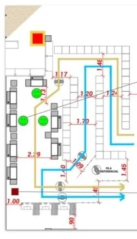
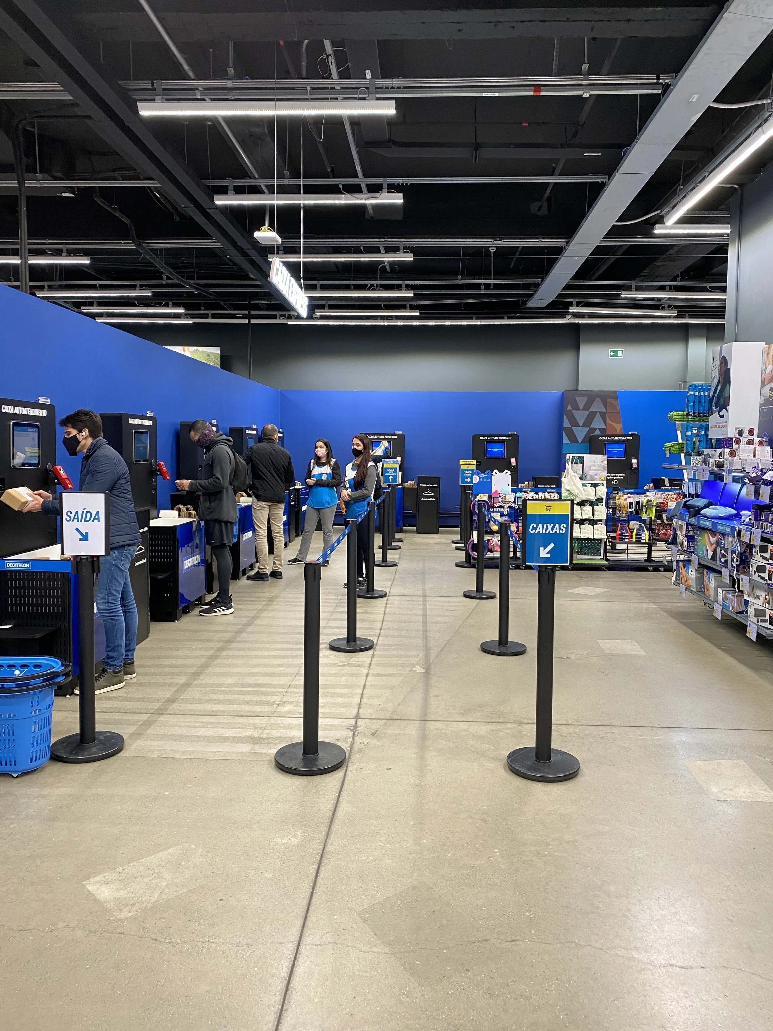
Assistance team at work.
Checkout queue mapping.
What I Learned
Scaling starts with clarity: aligning to familiar patterns unlocks faster adoption.
Physical and digital co‑design is essential in retail: small hardware details can reduce friction and keep queues moving.
Brand‑consistent contrast and content hierarchy materially improve legibility and confidence at checkout.
The distant window display

São Paulo’s largest store sits on Marginal Tietê: three lanes, 60 km/h, on the passenger’s right.
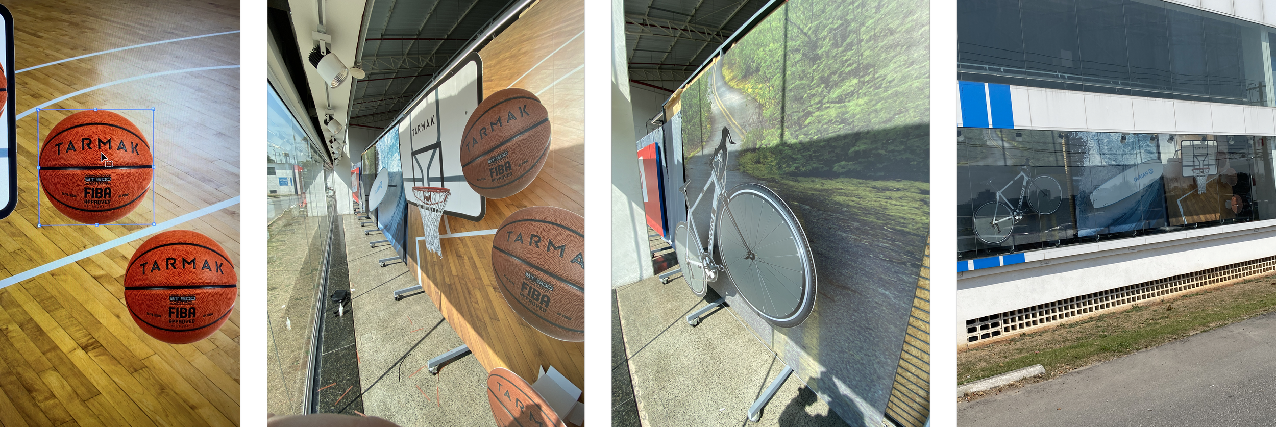
The facade is clear; the window wasn't clear, bad angle, >50 m setback, and glare. With less than a month and a tight budget, we skipped a “pretty window.”

My idea: lets create a 'fake' one.
We used big, high-contrast product panels printed on cardboard. We mounted these to existing gondolas and maintained a consistent brand image. Approved day one, produced by week two, and readable from a moving car, so effective that it stayed up for over four years. ✅
Solution: Use big, bold product prints on cardboard attached to gondolas. We don't need any new fixtures, and it stays on brand.
Outcome: Fast approval, fast rollout, long-term impact (4+ years). If they can’t see it, it doesn’t exist.
Sustainability Dashboard
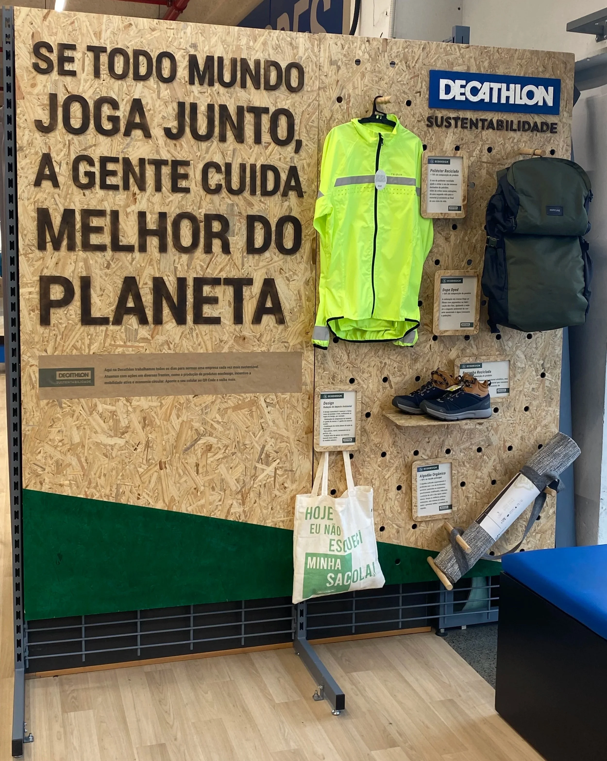
I led the design and rollout of a modular, recycled pegboard dashboard. It showcases sustainable products in-store. Intercept interviews showed that customers care about price first.
However, they also want to know about materials, production, and where products come from. The new solution replaced the planned mannequin island. It improved visibility in tight spaces.

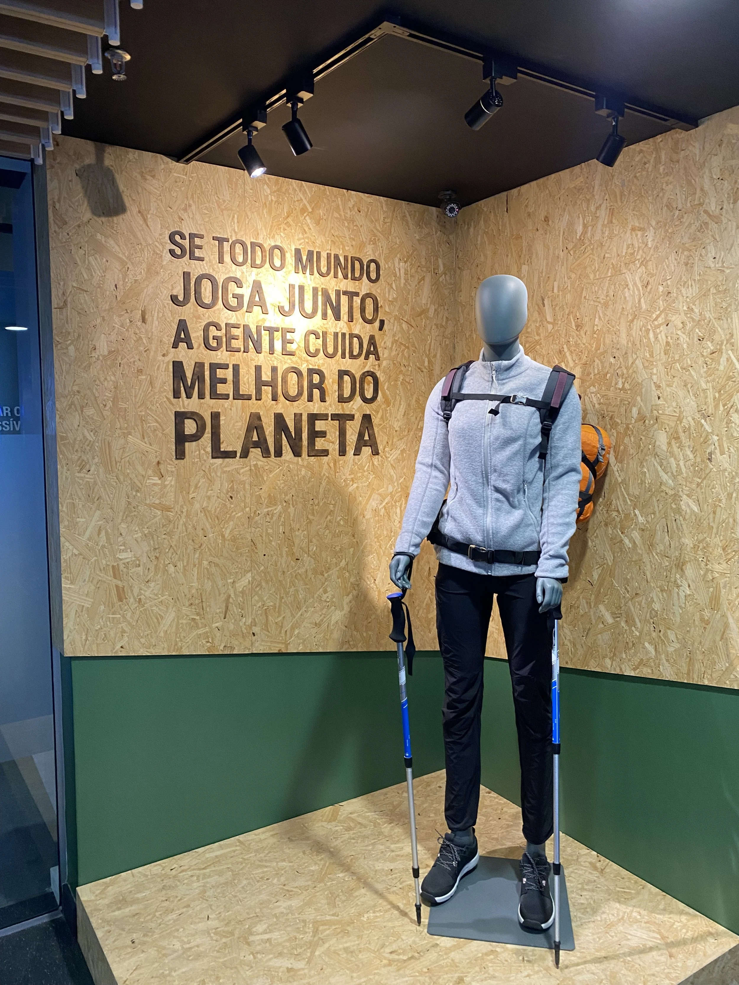
Staff can customize in a short amount of time, and it uses dwell time zones and a small footprint. It is easy to read and personalize. It fits tight spaces, lets staff swap products in minutes, and sits where people actually pause (like fitting rooms).
This change caught the attention of leaders. It boosts interest and sales in sustainable products.
Result: a clearer story, more attention, and higher sales for sustainable products. Also, the display boosts the message.

