YDUQS


YDUQS: A Brazilian holding company transforming higher education, serving over 750,000 students across multiple institutions.
Goal: Create user-friendly and engaging digital experiences. These should encourage students to adopt the tools, improve their learning, and maintain consistency on both app and desktop platforms.
Challenge: Start an app that will use the same wireframe and design system for various distance learning higher education institutions.
Action: I was the second UI Designer on the new "App do Aluno" team. We had four designers until the end, working together to update the app's legacy. This work involved contributions from the Engineering and Product teams.
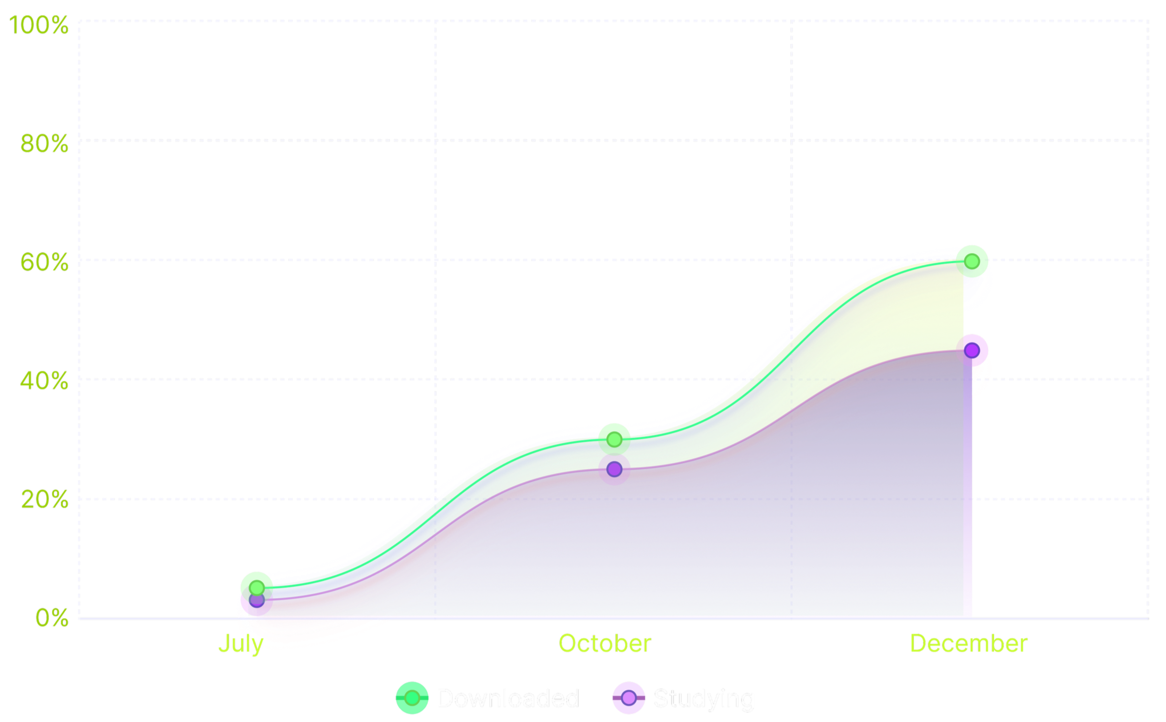
Result: After launch, there has been an increase of over 60% in the number of app downloads. In under 3 years, the app has become a must-have for users. It greatly improves the payment process, whether using PIX or a bank slip.
Work performed: UX/UI, Prototype, Design Planning, Design Delivery.
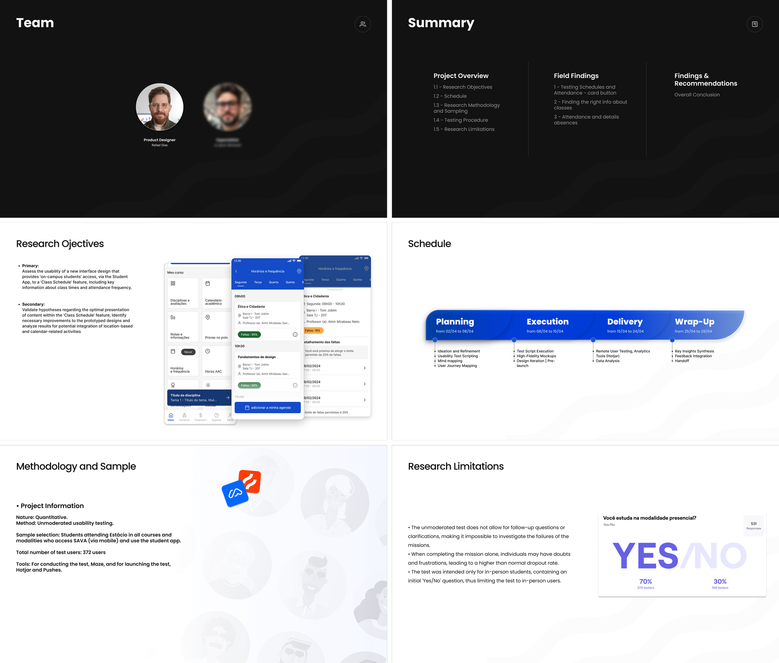
Role: Product Designer and Researcher
1. Before joining
the company
Here’s how it looked
before the 2021 update.
In this 1st version, the CTA buttons led students to the desktop platform. This meant the app had to include its own pages or embed the platform within it. This need demanded significant time and dedication from the research team, which was still in its early stages.
The Outcome:
When the pandemic concluded in 2021, higher education underwent a significant transformation. Online learning created opportunities for innovative EdTech initiatives, and YDUQS seized this chance.
YDUQS launched the new app at the same time as the Design System. That was when I joined as a UI designer, and I began working on the app within the first six months, becoming an integral part of every phase and initiative. Here’s why:
The team marked the launch with impressive operational growth. In the first semester, over 40% of students used the app, and the download rate surpassed 60%.
I took great pride in witnessing such rapid adoption, which underscored the importance of learning through development. I saw the company as a true learning lab, driven by designers and developers committed to progress.
2. After joining the company
Here’s how it looks
after the 2021 update.
I'm always prod to tell this story: We saw the app's positive impact on students' daily routines. In an interview, a 35-year-old mother shared that she used the app for her studies and tests. She didn’t have a computer. At the same time, she cared for her autistic child. This highlights our solution's importance for diverse users.
3. Usability Evaluation
Usage Frequency
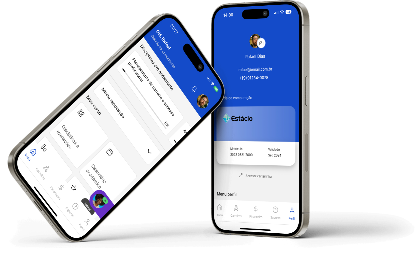
This project aimed to validate whether students could easily find critical academic information, such as schedules, attendance, and absence rates, within a newly designed area of the app.
Using large-scale quantitative usability testing on Maze, we analyzed how users interacted with cards, buttons, and tags, identifying friction points and opportunities for improvement. These insights supported data-driven product decisions and helped evolve an early-stage concept into a more functional and scalable experience.
• RESEARCH OBJECTIVES
Validate whether users could quickly find academic information and correctly interpret interactive components.
Assess how navigation patterns impacted task success and efficiency.
• SCHEDULE
The project followed a defined timeline with clear milestones and delivery deadlines, requiring continuous alignment between planning, execution, delivery and design decisions.
• METHODOLOGY
Large-scale unmoderated testing with active students using Maze.
Behavioral data and click analysis were used to identify usability risks and opportunities.
• RESEARCH LIMITATIONS
As an unmoderated quantitative study, this research did not allow real-time follow-ups, limiting deeper insight into user decision-making. Independent task completion and restricted participation to in-person students may have influenced dropout rates and sample scope.
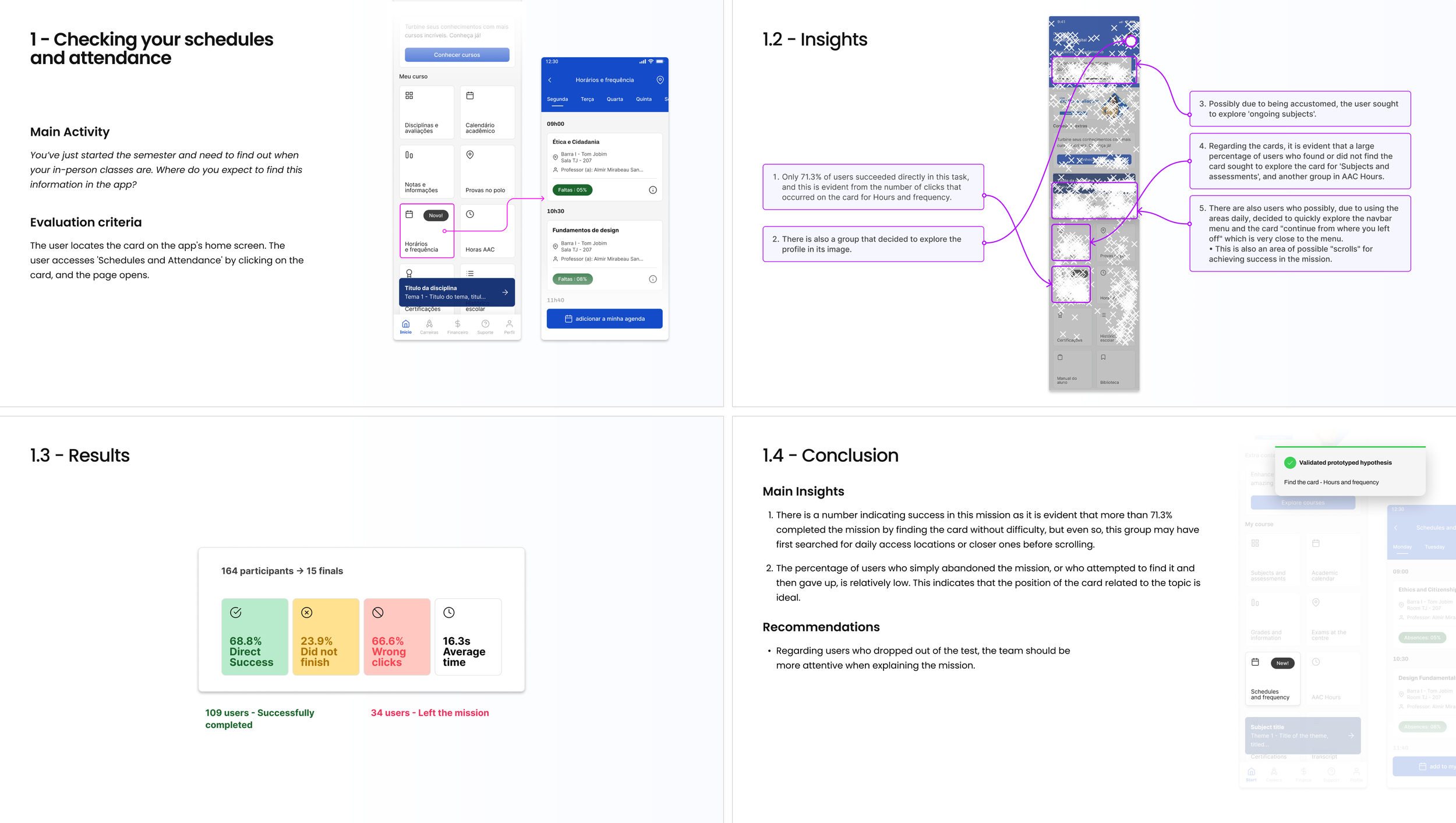
Task 1 - Checking Schedules and Attendance
In this task, users were asked to locate their schedules and attendance information. The goal was to evaluate whether the home screen hierarchy and card-based navigation effectively supported task completion.
Results showed a high success rate, validating the card layout as a primary entry point, while also revealing opportunities to improve interaction clarity.
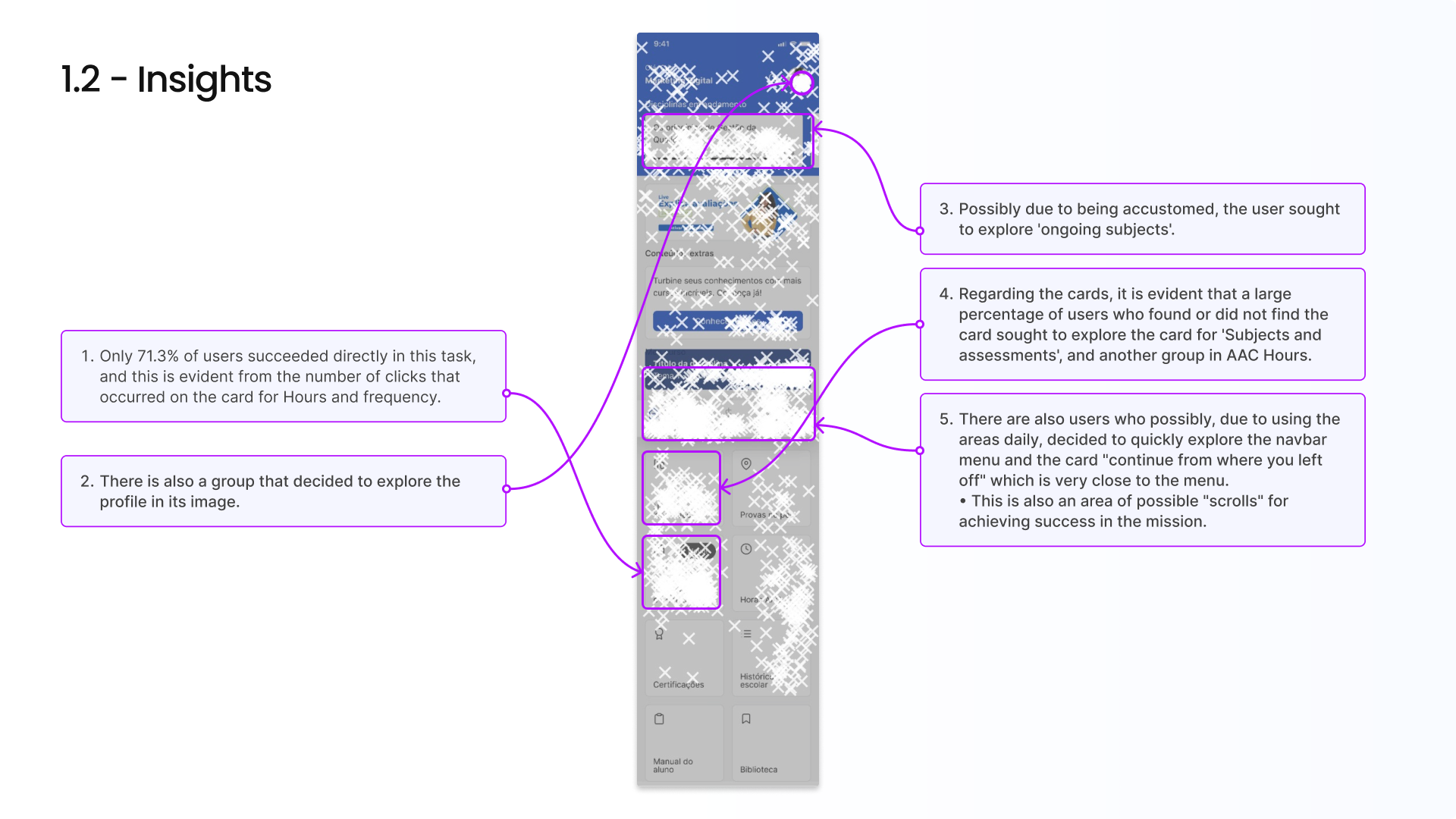
Task 1 - Insights & Results
Clickstream analysis indicated that users prioritized familiar visual anchors before scrolling, often exploring areas near navigation and profile sections.
Cards containing embedded action buttons significantly increased task success rates and reduced misclicks and completion time.
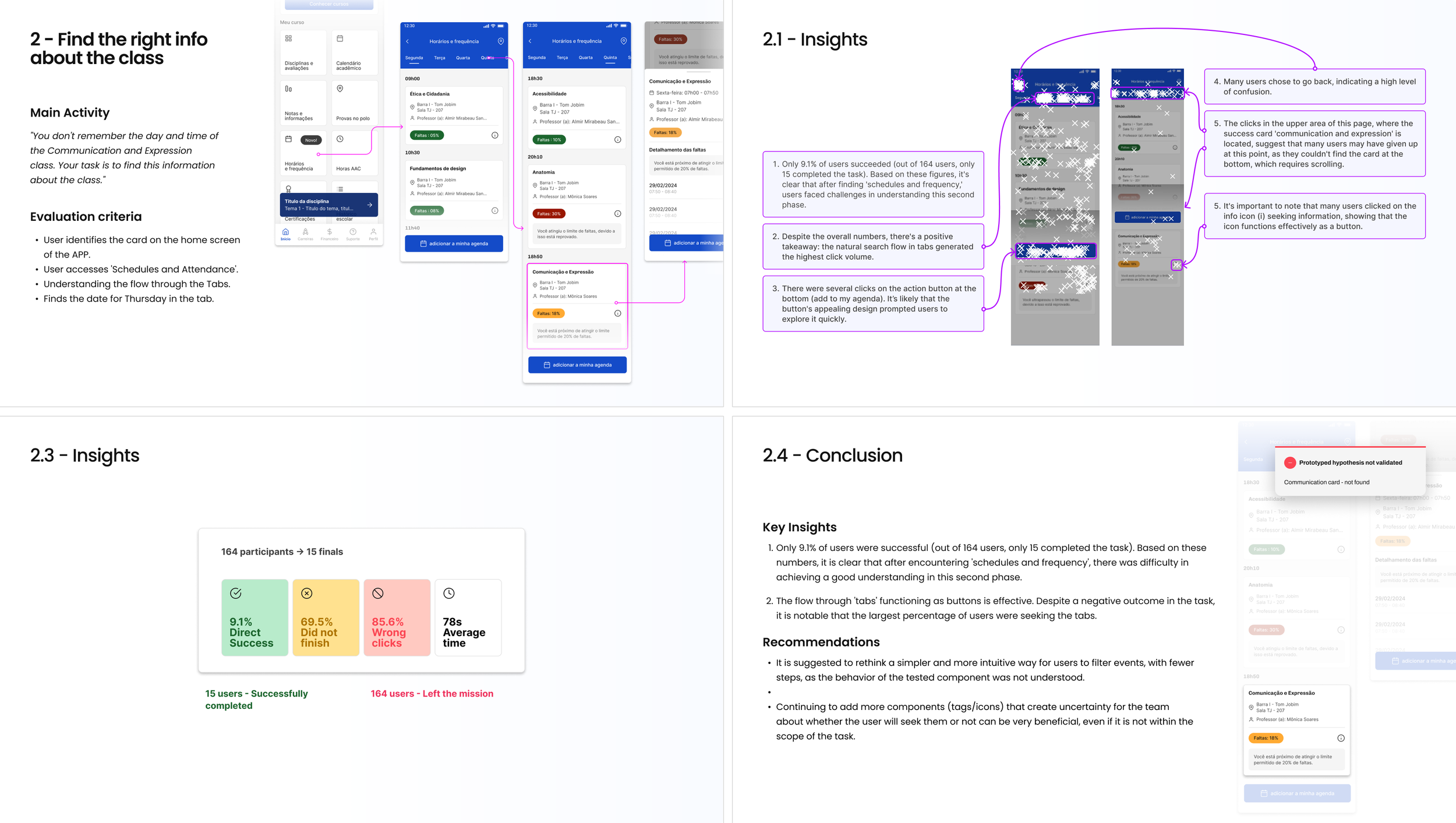
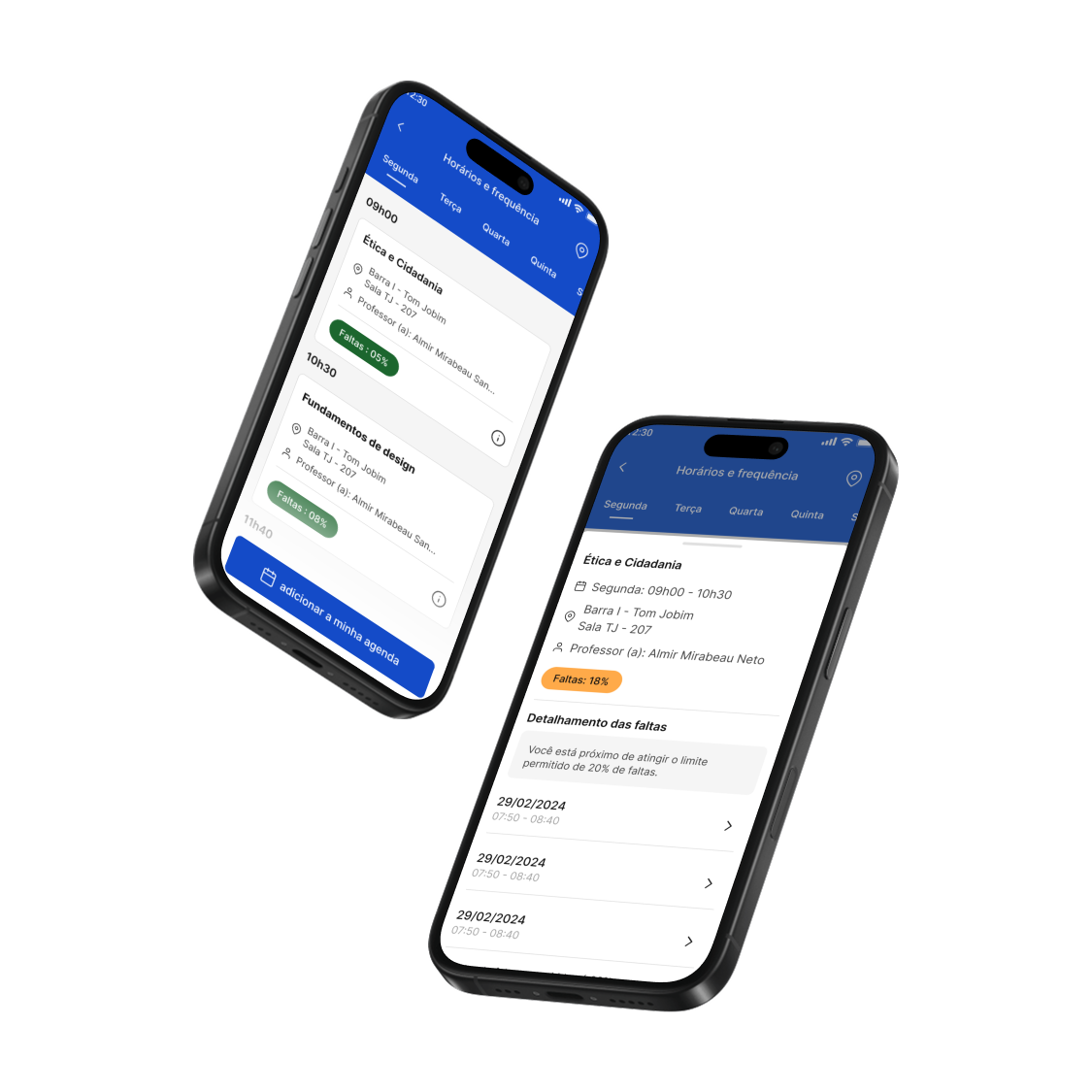
Task 2 - Finding Class Information
This task evaluated users’ ability to find specific class details, such as day and time, across tabs and content lists.
The results revealed cognitive friction caused by complex navigation paths, indicating the need for simplified information architecture and clearer hierarchy.
Task 2 - Insights, Results & Conclusion
With a low completion rate, the second task exposed a misalignment between system structure and users’ mental models.
However, strong engagement with tabs and buttons suggested that the issue was related to clarity rather than motivation, guiding future redesign strategies.

Task 3 - Attendance and Absence Details
This phase focused on how users accessed detailed absence information within specific subjects.
Most users initially explored the home screen, reinforcing its role as the primary navigation hub.
Task 3 - Insights, Results & Conclusion
Clickmaps revealed strong interaction with high-contrast elements, such as tags and indicators, highlighting the impact of visual emphasis on user behavior.
Internal action elements proved more effective than generic clickable areas, informing future UI patterns.
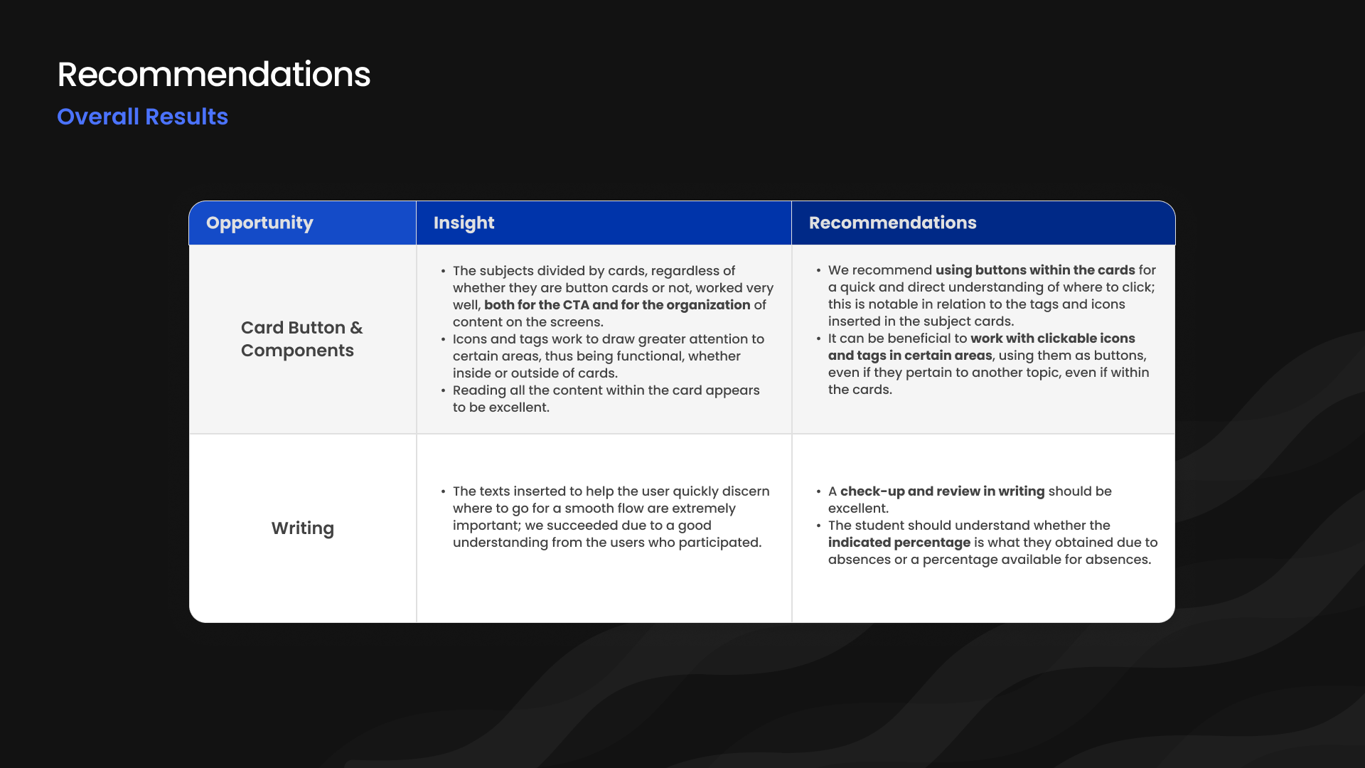
Although parts of the study revealed low success rates and high friction, the data provided critical insight into users’ mental models, interaction patterns, and cognitive load. By analyzing behavioral signals, misclicks, and navigation flows, we reframed negative outcomes into strategic opportunities for system optimization, information architecture refinement, and interaction design improvements.
This research established a strong foundation for iterative development, enabling more confident, data-driven product decisions.
4. How to work
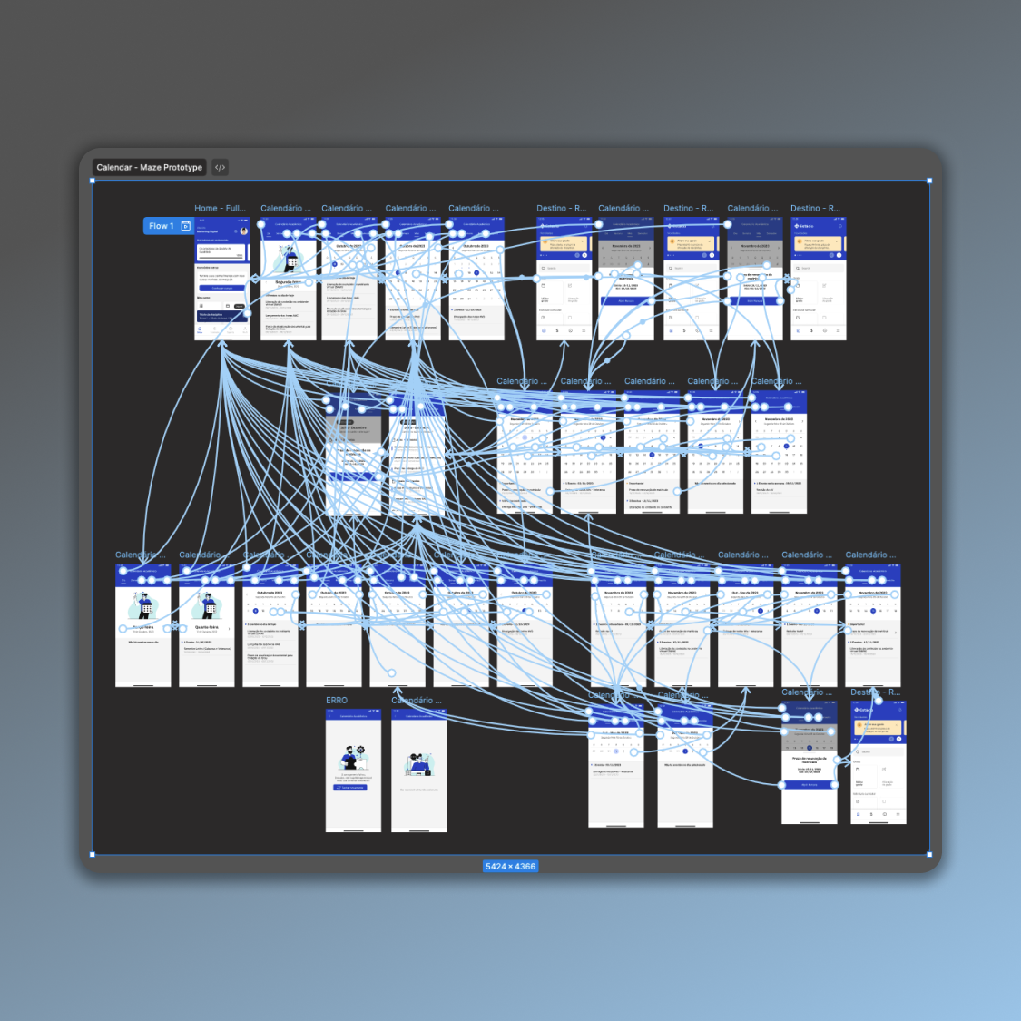
Interactive Calendar:
Project: A calendar that displays the current month, including weeks and weekday labels, and allows navigation to previous and next months within the current semester (January–June or July–December).
We initiated a rigorous sequence of workshops, stakeholder recommendations, and preliminary studies to scope the research. Early drafts prioritized functional flows over visual fidelity.

After incorporating research feedback, we expanded the benchmark and refined the drafts, with engineering continuously assessing quick wins and defining the synchronization model for per‑student exams, coursework, and subjects by term across the five institutions.
This hand-sketched draft emerged as the most effective approach and was approved, consolidating the interface into three tabs: "Day | Month | Year."
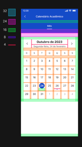
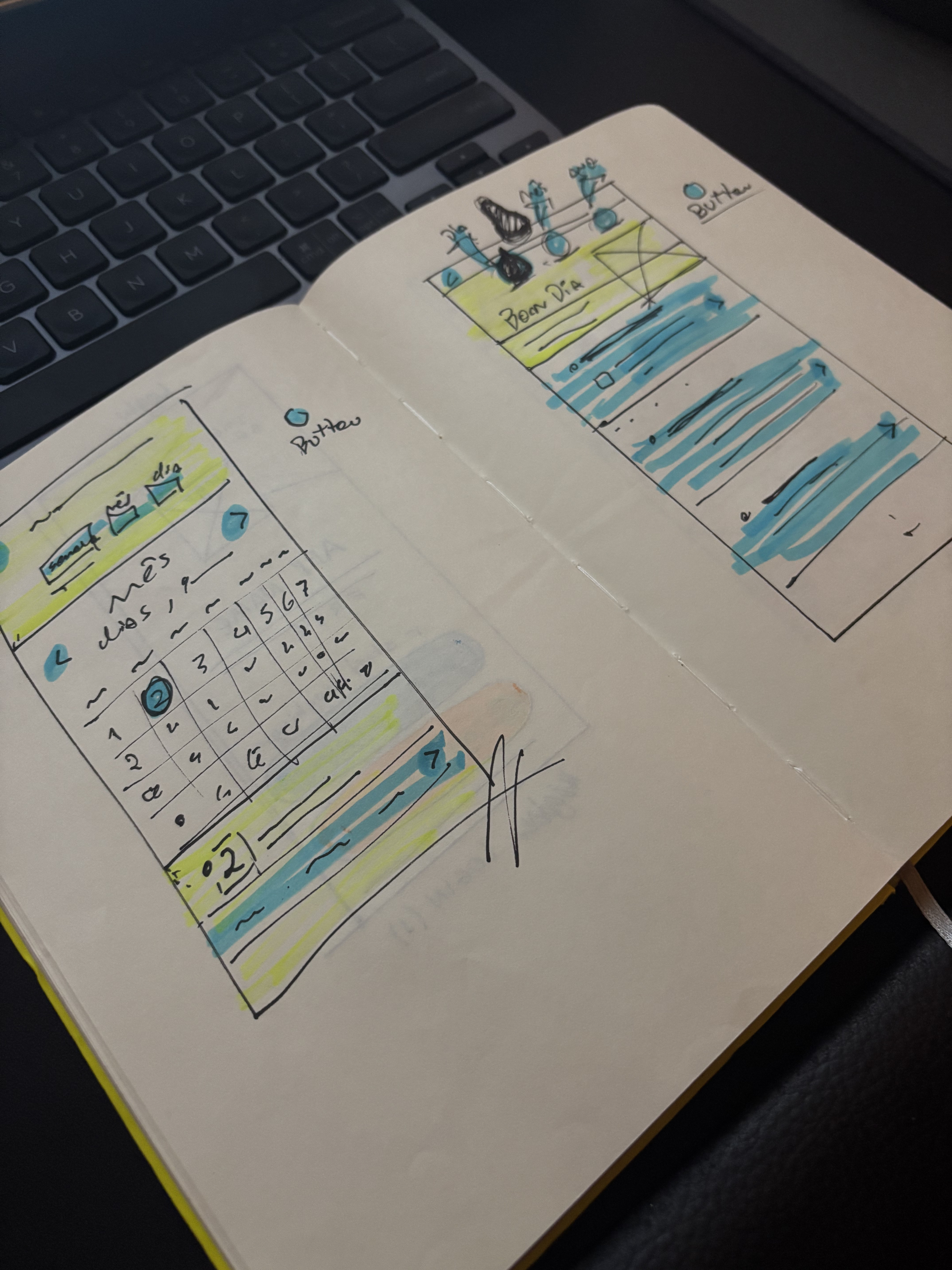
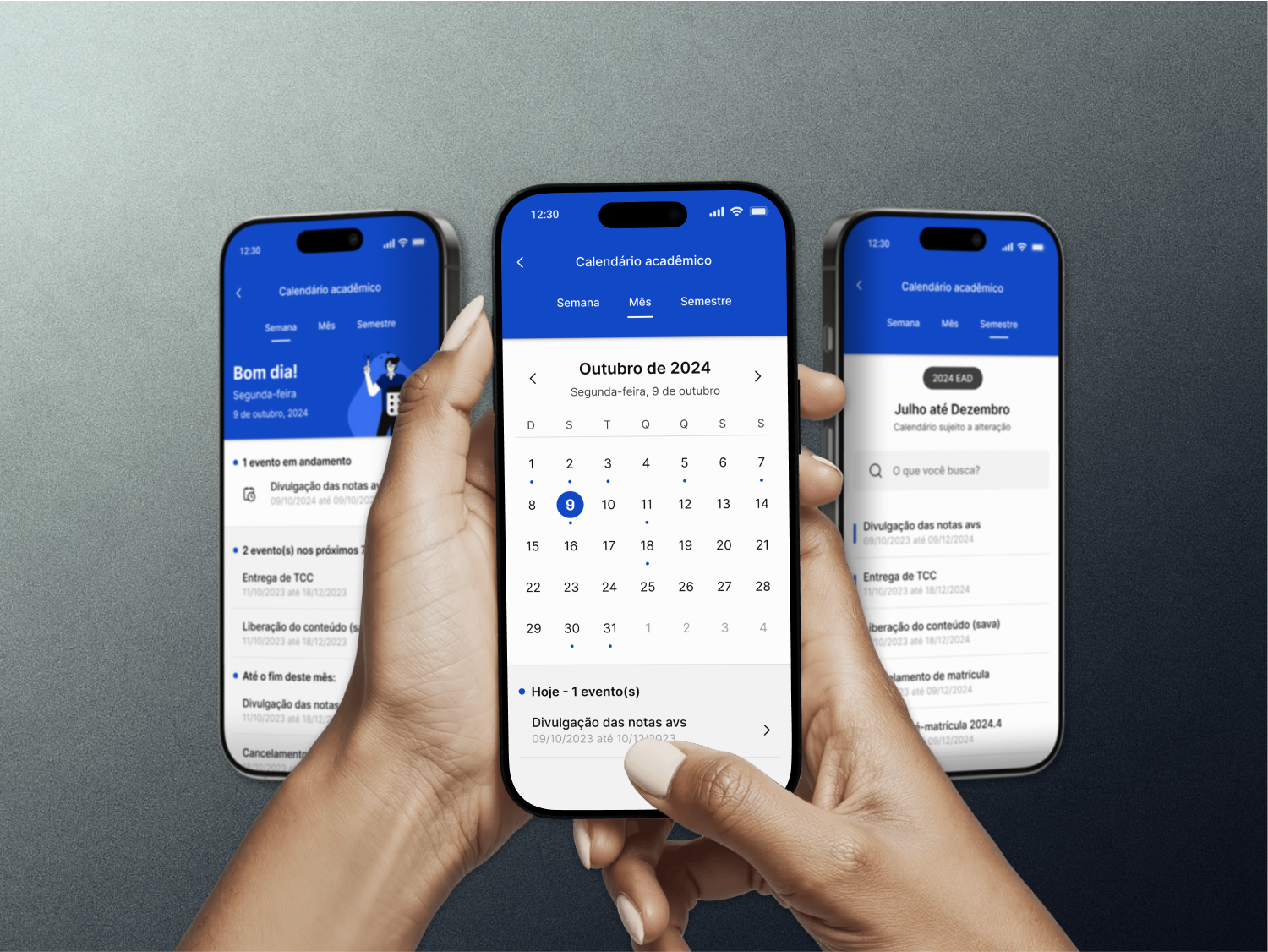
Yes, that was the key. The calendar was widely praised by leadership and by users who rely on it to stay on top of their schedules.
-
![]()
Calendar Prototype
Calendar Prototype
-
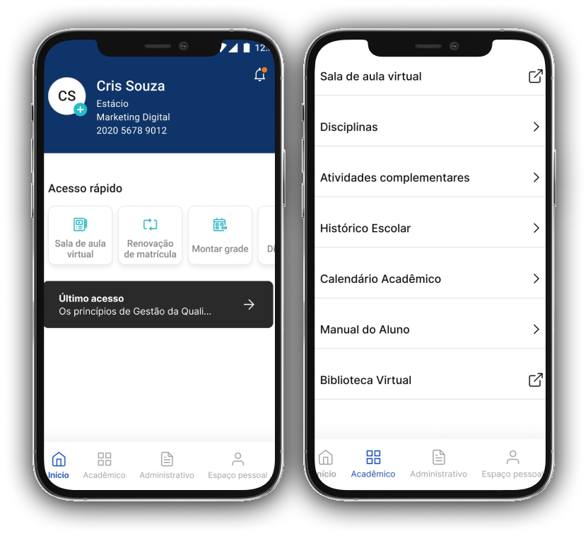
![]()
Finance Department
-
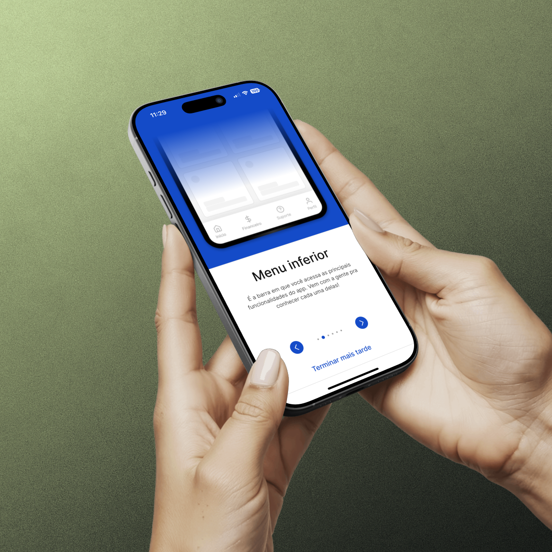
![]()
Onboarding Process
-
![]()
Usability Evaluation
-
![]()
Polo Map
-
![]()
Padding Measurement